Today’s consumers are the most knowledgeable and thoughtful shoppers in the history of retail, which is why it is increasingly important to understand where and how to best place items within the store.
Retailers need to use store space to maximize sales. The goal is to arrange the products in a strategic way, minimizing the waste of space and ensuring a significant shopping experience.
How to do it?
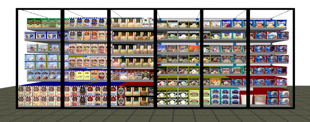
Here comes the planogram. As you know, it is a schematic drawing, a representation, which helps to plan the placement of products on shelves or displays and the layout of the store, with the aim of maximizing sales.
But is it that simple? A planogram is good for everyone? No. Consumers are not all the same.
For example, we may have the customer who buys quickly, who wants to find things quickly, prefers a more limited assortment of items to choose from and with targeted products. Or the customer who likes to discover new things: he has more time to shop and wants to explore the shelves, but at the same time be efficient and want a greater variety of items with niche products; there are also those who are aware, who spends more time shopping, chooses carefully, is very careful but wants at the same time to be fast and needs a smaller assortment to avoid spending too much time shopping. Finally, let’s not forget that we could find the customer who buys impulse, who wants to quickly find things and needs a simplified assortment of key products.
We may also have the customer who has little time, who wants to quickly find the products pinned on the shopping list, and who therefore prefers a more limited assortment, consisting of targeted items.
Or the customer who loves to discover new things: he has more time to shop and wants to explore the shelves, and therefore he will prefer to find a wider variety of items from which he can choose: They will therefore need to be disposed carefully to avoid making the buying experience confusing.
Finally, do not forget that we could find the customer who buys impulse, “relying” on the most visible products and better presented on the shelf: in this case it will be even more important to choose carefully the arrangement of products, in order to guarantee the buyer good quality purchases’.
Since one of the main objectives is to ensure a great shopping experience, it is clear that a planogram can never be effective for all types of buyers.
The first step in building a successful planogram, therefore, is to define the most relevant categories and assortment for the store, which correspond to the mentality of consumers who attend it.
Let’s take a practical example: in some stores it will be preferable to expose less merchandise to encourage customers to engage and interact with key products, while in others it will be better to expose a wide variety of well-organized products, so that the consumer can choose comfortably. In this case also the territorial location is an element to consider.
How can we build a planogram that works?
Creating a planogram is a complex process, with many factors to consider, such as the specific layout of each store and the buying behavior of customers in the area.
But how is it possible to capture a customer’s attention, and make them evaluate the purchase of products not on the shopping list?
For example, it is good practice to place the products of interest at eye level. Shelves at this height tend to receive maximum attention, while the lower shelves tend to have poor lighting, thus reducing attention.
It is also preferable to place the product on the right side of the shelf, as we have the natural tendency to look right, or to go right, when we make decisions; you can therefore take advantage of this natural trend to place innovative or strategic products next to the reference products.
Another important aspect is to place key category drivers, or products that establish your core category, at the center of the exhibition space so that products that require high visibility can take advantage of the buyers’ natural “Z-glance”.
In addition, there are only a few products that can have a markedly positive or negative impact on the performance of specific items and even on the entire shelf. Consider “product proximity” and how it affects your shopping experience and sales.
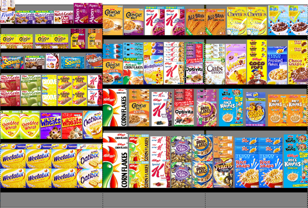
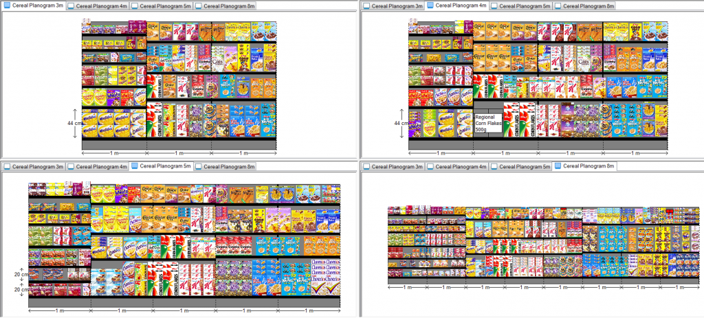
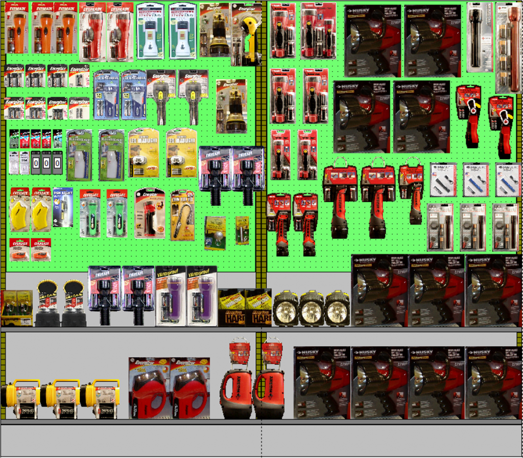
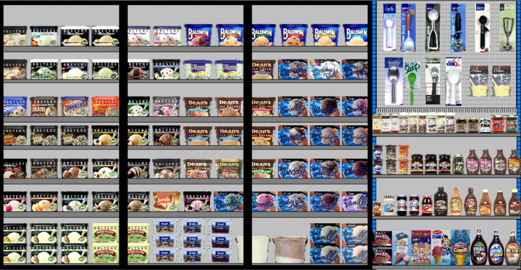
Examples of a planogram
In the previous lines we have seen what are planograms and what are the main elements to consider to build an effective one, now let’s look at some examples.
We conclude
Before concluding, I would like to highlight a key aspect: the inadequacy of the availability on the shelf involves the loss of sales and turnover, as well as an undervalued dissatisfaction of the customer.
According to an IHL Group study, shelf relevance costs retailers nearly $1.1 trillion globally, meaning that sales in the same store could increase by 10.3% if attention is paid to “shelf relevance”.
Planograms are an essential element for retailers. They are a highly strategic element, supporting inventory and inventory management, and helping store staff to place items efficiently.
That’s why, in addition to creating a planogram, it is essential to verify the compliance of the shelf.
The last tip before the greetings: the implementation of a suitable technological solution can multiply the advantages of the planograming process and significantly improve the customer experience, ensuring the consistency of the retailer’s brand in all points of sale and the success of promotional offers.


